interior design

inspired dining : zenkichi


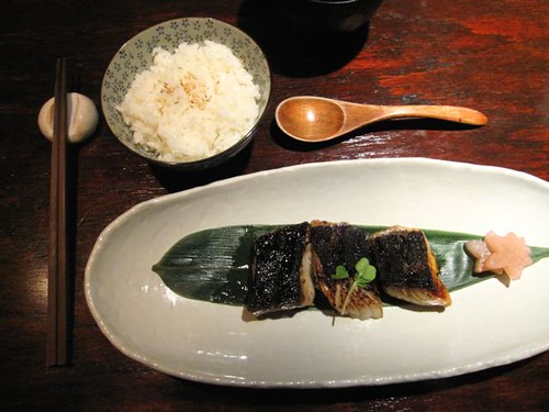
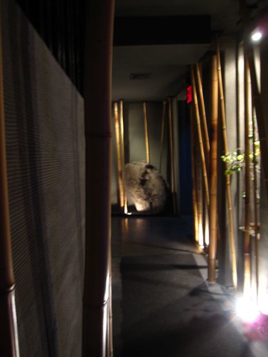
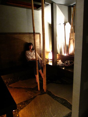
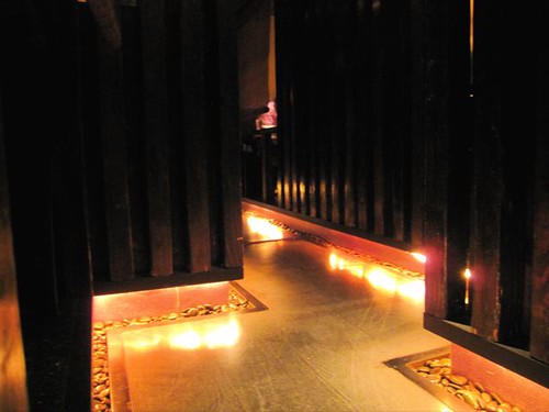
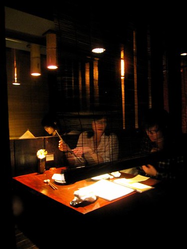
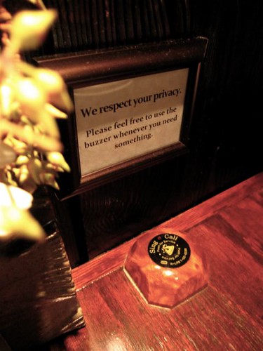
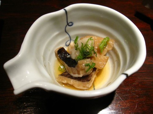
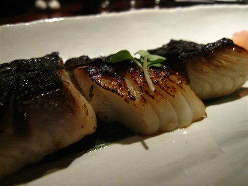
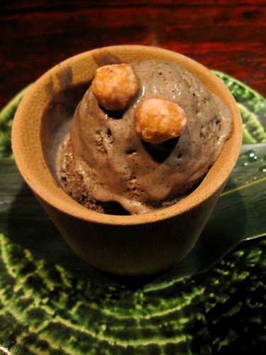
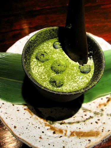
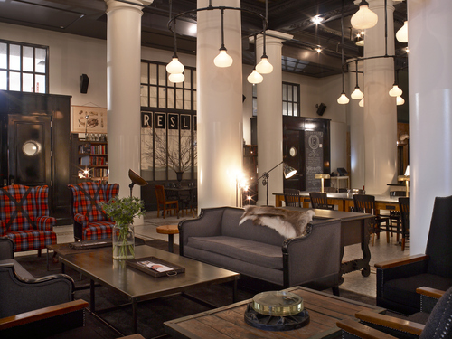
To continue my birthday week of decadence, my friends Melanie and Jacquelyn took me to Zenkichi Modern Japanese Brasserie in Williamsburg, Brooklyn. It was my first time and I have to say that it has to be New York's best. First of all, the interior design reminded me immediately of one of my favourite films: In The Mood For Love. The space is very dark, cavernous and maze-like. The reception area looks and feels like a spa and definitely sets you up for the dining experience. Each table was very private, you don't really feel other diners. There is also a button to call the servers, otherwise, they really leave you alone. The service was superb, almost ceremonial. A shade separates your table from everything and it gets lifted and lowered as each course is delivered to your table. The lighting design of this very dark space is also well done. It all makes for one of the sexiest restaurant designs I've seen in New York. And the food? Well, I was very impressed. We had the 3-course pre fix and a sake flight. Everything from beginning to end was incredible. I loved my Saikyo black cod main course (above, marinated in Saikyo miso) – probably the best I've ever had. The desserts (I had the chance to try both) were: Frozen Black Sesame Mousse (chocolate-based silky frozen sesame mousse) and Matcha & Blueberry Rare Cheesecake (blueberry infused Japanese-style, non-baked cheesecake with bitter Matcha green tea powder from Kyoto). They were simply amazing. All of it made for a truly superb dining experience. A great way to end my birthday week (thanks to Jac and Mel!). I will definitely be back – next time I will bring a hot date ;)

New Yorkers, what are your favourite sexy dining spots?


The Amazing Sake Flight (they have over 50 varieties)


curated on open house new york

We share the office space with an interior design studio called Curated. Co-founder Elena Frampton heads up their New York office and her partner, Delta Wright, runs their LA office. I featured Curated and their beautiful work on my blog last year. They were recently featured on the show Open House New York. Watch the video below to see the episode where they showcased one their projects, a beautiful Flatiron loft.

View my previous blog post on Curated. here.

building on bond


Last weekend, I took a break from a photo shoot to have a late brunch with a friend at Building on Bond. There was something about this place that I just really loved. It had the look and feel of the wood shop classroom I took drawing classes in back in high school. It had the kind of laid-back neighbourhood charm only Brooklyn (former bodega space) can offer. They have everything from the flat file drawers, wood shop tools, salvaged fixtures and school chairs. The space is founded by design and construction company, Hecho, Inc. – the restaurant/bar space also houses their offices and workshop. Apparently, the place became so popular, they had to dedicate more space to the restaurant area than originally planned. My favourite part of the space were the tables that had the rolls of paper built in and held in place (as place mats, of course) by metal clamps. This place made me wish I lived on this same little corner of Brooklyn too.


inspired minimalism : the spencer apartment

This past weekend, I had a chance to photograph the Brooklyn apartment of my friend and interior designer, Juliette Spencer. This is the apartment she shares with her husband, Cass – both are originally from the UK. I fell in love with the impeccably designed space after attending her birthday dinner party last month.

They bought the two-bedroom apartment and gut renovated it in 2009. Juliette kept the palette monochromatic, staying true to her own sensibility. The idea was to keep it simple and minimal – which was key to making the space very comfortable for them. All of the furniture was chosen with this in mind. She opened up the closets and installed full height doors with pivot hinges to maximize storage space. The British couple installed European style appliances to give the kitchen more space. The black cabinetry was chosen to emphasize the ceiling height. The idea behind the black kitchen and entrance was that once the lights were off, these spaces would disappear when you're relaxing in the living room area. I loved this idea of "invisible" architecture.

Aside from the gorgeous Hans Wegner wishbone chairs for the dining room, I adored their gorgeous, modern De La Espada bed! The building also has a lovely roof deck space with a 360° view of Brooklyn.

Thanks to Juliette for allowing me to document their beautiful apartment.


IMG_1637.jpg

IMG_1638.jpg


All photos by myturtleneck

the ace inspires spring

I was (once again) at the Ace Hotel for a drink the other night, my new favourite spot in the city. There was a combination of the vibe of the crowd and the look and feel of the place that I just really loved. So much so that I had to put together an outfit inspired by it. I hope you like :)

See my previous post on the Ace Hotel here. Thanks to Melanie for her fashion site tips.


How cute is this stripey dress?


I had to balance off the sweetness of the dress with a touch of grit with with this jacket


This necklace was perfect homage to the Ace ;)


Another dash of tough with this boot.


1) Indigo Striped Dress by Wikstenmade
2) Hunting Jacket by Superdry
3) Gold Antler necklace by Miss Mouse on Etsy
4) Maxine Trapunto Shortie Boot by Frye
5) Le Mini Sac by Clare Vivier

transported ancestral architecture

My Aunt Rose moved back to the Manila from San Francisco after she married and had a couple of kids (back in the 90s). During a visit to her father's ancestral town of Vigan, she had an idea – a monstrous undertaking only possible in places like the Philippines. Vigan is a town well-known for it's Spanish colonial architecture. In fact, since the 18th and 19th century, it has retained the most of the colonial architecture of any city in the Philippines. It is gorgeous and quaint. And yes, people still use horse-drawn carriages in the Philippines (called kalesa).

During my Tita Rose's visit to Vigan (tita means aunt in Tagalog), she heard about a house and land up for sale there. She heard the house was to be demolished. After going to see the house, she decided to purchase just the house and get this: took the house apart – every bit – and transported it back to Manila (I believe by truck, then boat) and rebuilt it next to a river outside of the city! It was a five plus year undertaking. One that that would have cost ridiculous amounts of money in any other country. You have to take into consideration that the Philippines is made up of over 7,000 islands. Transporting anything is an undertaking. The house was rebuilt on a plot of land overlooking a river. Various parts of the original house were repurposed as pieces of furniture (i.e. solid wood wall panels as the new dining table and front door, banisters as new bed posts, etc.). It's incredible.

So a few years ago, my sister Caroline (among numerous other talents, is a photographer) photographed the house for a local magazine. The house is often rented out for film, television commercials and photo shoots. The other images below are ones I took during my last visit a couple of years ago. Please click to enlarge the images (they are huge).

My Tita Rose's house was an amazing feat. It was a project of a lifetime, an amazing contribution to cultural preservation. Her creativity and ingenuity are an inspiration. She's not even a trained designer – she is a social worker, counselor and unlike 95% of Filipinos, a devout Buddhist who often goes on silent meditation retreats for up to 60 days. That's right. Sixty. She has this tranquil intelligence about her and she's incredibly kind. I love that she had a rooster, dogs and a cat running around the house the day we were there for a visit!


These are some examples of Vigan architecture.


I love the hammocks-turned-chairs

Capiz shell dividers and antique furniture


a living room mini-makeover?


If I could give my living room a makeover, I would add the pieces above. I discovered Bond & Bowery when I was exploring the Mid-Century Modernist. The coffee table would have been perfect. It's got that tropical modern flavour that I want (it's already sold!). That lamp above is called a Rumba M46, I've been wanting it for years. One of these days, it will happen. Currently, this is what my living room looks like. I wouldn't mind lightening things up a bit. What do you think?


frank gehry : the art gallery of ontario


I was in awe of Frank Gehry's design of the Art Gallery of Ontario (AGO) in Toronto. I do love those unapologetic curves in his work. As a sidenote, I appreciated his work much more after seeing the documentary Sketches of Frank Ghery. The best space in the gallery is Galleria Italia (see the first two photos above). It is breathtaking. Gehry also designed the most beautiful wheelchair access ramp I've ever seen (see photos 3-6). I must mention, too, that the art collection in the gallery was really impressive. It's really worth a visit.


inspired transformations : was/is

Featured in this week's New York magazine are several home design transformations entitled Home Design Fall '09: Was/Is. Below are two of my favorites: The Wall Vanishes and The Pastoral Porch.

The first is an abandoned East Village brownstone building transformed into an amazing condo with a vanishing wall. The before and after photos are incredible! It's difficult to see in the photo, but there's actually a glass fence that acts as a barrier from the outside for when the wall "disappears." I love it.

The interior of the building AFTER (scroll down to see BEFORE image)

The front of the building BEFORE
The front of the building AFTER
The interior of the building BEFORE

The second example, The Pastoral Porch, is a barren brick terrace turned living garden designed and built by a veteran green builder and furniture designer. The porch is now filled with vegetables and herbs that can be harvested year-round. I love the innovation that happens in New York where space is so limited.

All images from NYmag

Check New York magazine to read the full article and see additional examples.

my ultimate dream kitchen

This is hands-down my ultimate dream kitchen. The furniture and kitchen design is by Hansen Kitchen out of Copenhagen. Gorgeous with plenty of light and no obnoxious color palette (except for the plants I would bring into the space). Spare yet lived-in and comfortable. I also loved the Joyce cabinet by Pinch Design in London and old school stool from Restoration Hardware. I always love mixing old with new. It makes things more interesting and less homogenous.

One day...

photos by Hansen Kitchen


Vintage chair photo from Restoration Hardware


Joyce cabinet by Pinch Design

le corbusier : maison la roche


This is Maison La Roche and Maison Jeanneret in Paris designed by one of the most well-known pioneers of modernist architecture, Le Corbusier. I took these photos during my (amazing) month-long stay in Paris in 2005. It was established as a museum in 1968 but is currently closed for renovations. The La Roche-Jeanneret house is actually a pair of semi-detached houses built in 1923(!). The houses are also holds the world's largest collection of Le Corbusier's drawings, paintings, studies and plans.


inspired workspace : neals yard remedies

I love the design of the Neals Yard Remedies workspace and headquarters in London. All interior and furniture design is by a London-based husband and wife team (and company) called PINCH. Neals Yard Remedies is an organic health and beauty brand. They wanted a positive work environment that reflected their brand values. I love the use of chalkboard paint on the cabinets and the wall calendar. It looks fun and comfortable without looking cutesey.


All images from PINCH Design


a mid-century modern wishlist

Lately, I've had this urge to add or change a few things around my apartment (if only I could afford to!). I've always loved mid-century modern furniture and architecture. Warm modernist or tropical modernist would best describe my personal style. I love mixing up vintage pieces with modern ones. It always creates a more interesting, lived-in space that's still clean. My personal style is not overly feminine or colorful but it's definitely warm and modern. The consistent reaction people have to my apartment is that it's very cozy. My ideal home would probably suit a warmer climate than the northeast. But who says I can't have elements of it in my space?

Below are some mid-century pieces that caught my eye recently...

Ervin Wüd lamp


Wood slat bench/coffee table from Surfing Cowboys (no longer available)


philip johnson's glass house

My interest in architecture began long before design school. It was only appropriate that I end up being taught Design History by an architect. It was back then that learned about Philip Johnson's Glass House – one of the most well known examples of modernist architecture.

I was thrilled to get an (unexpected) chance to see it this weekend in New Canaan, CT. The tours are so popular that appointments sell out very quickly each season. But I was lucky enough to acquire tickets from my cousin who wasn't able to go herself. She had tickets booked for a whole year!

It was an interesting and very informative 90 minute tour of the house and the other buildings on the property. The house was completed in 1949 and was Philip Johnson's private residence (and where he later died). Below are my photos (and annotations) from the tour. I highly recommend taking the trip up if you live/visit the NY area. It was beautiful.

The window at the visitor's center

The front gate to the property was designed by Johnson (225 sailing cables are utilized to raise and lower the large bar).

Da Monsta was originally intended to be the visitor's center. Now not being used.

window from inside Da Monsta

Eames Bertoia chairs inside the presentation room inside Da Monsta

The Glass House

A view from the exterior back

Mies van de Rohe Barcelona chairs in the living room


A view from the kitchen area


A view from the dining area

The small bed in the very open bedroom

The bathroom on the other side of the fireplace


The view of the pool from the bedroom area

I loved the cone shaped (bottom/inside) swimming pool.


A view of the Lake Pavilion from the back of the house

The entrance to the Painting Gallery


The Painting Gallery had a combined bathroom/winebar area

The rotating walls in the painting gallery allowed for changing views as needed
Frank Stella painting

Julian Schnabel painting

A fabulous silk-screen portrait of Johnson by Andy Warhol

The entrance of the Sculpture Gallery

Gorgeous light and space in the Sculpture Gallery