design

blog birthday no. 2 + a giveaway!

Wow. It's been two whole years since I started this blog. I can hardly believe it! I can only hope that you've enjoyed reading it as much as I've enjoyed sharing :)  

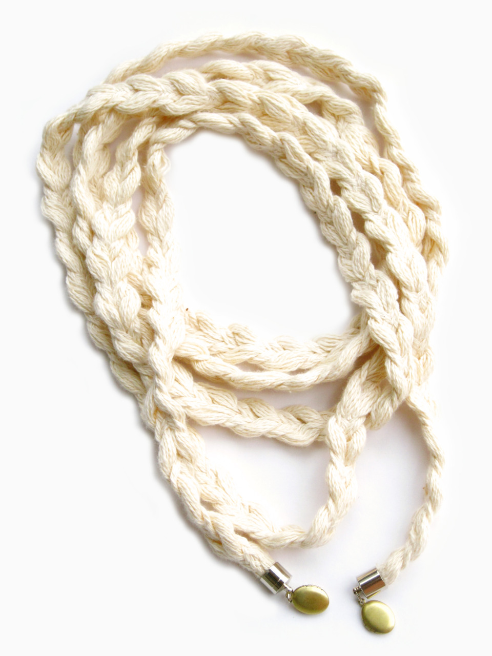
To celebrate, I am giving away this beautiful scarf necklace designed by my good friend, the talented, Melissa Clemente. It's one of my favourite pieces of hers this season. It's made of a very soft knitted yarn (100% cotton). It's the coziest kind of necklace to have on in the winter.

To qualify to win: check out her website, follow her Tumblr or on Twitter and leave a comment and your email address below. You'll have until Friday, February 4th at 6pm to enter. The winner will be chosen at random. Good luck! 

For those of you in Toronto this Saturday, February 5th: Come by the Drake Hotel between 9am and 4pm for The Guilty Pleasures Designer Sale and you'll be able to see and purchase Melissa Clemente's jewelry. I will be swinging by there, too. So come by and say hello :)   


come up to my room and other activities

As part of Design Week in Toronto, I paid a visit to the Gladstone Hotel's annual Come Up To My Room event as well as the Do Design walk down Dundas Street West. Below are some of the photos (artist/designer listings are on respective websites). All in all a good day of visual inspiration and some good nibbles of food along the way. It actually made me toy with the idea of maybe trying to participate next year. Hmmm...

myturtleneck air

I knew my recent move to Toronto would involve re-establishing a new network. Not a small feat (and one that I know will take some time). As I continue to work on projects for New York clients, I knew I had to come up with a way to also introduce myself to the best of the best of the Toronto design community. It had to be a self-promotion package that commanded a little more attention than just another email. It was important that it to express not only my abilities but also my sense of humour. The photos below are the result. I had SO MUCH FUN creating this. Amazingly, I was also able to find a digital printer (in the U.S.) that also had the capability to do die-cuts (and perforations!) in smaller quantities. A big thank you to everyone that helped me through this process. 

Do you like?


toronto subway signage : name that typeface

Unlike New York's subway system (set in Helvetica, of course), Toronto's subway system signage is set in a typeface very similar to one of my personal favourites: Neutra. It possesses the same mid-century modern qualities but it's not identical. For instance; the bottom strokes (aka legs) of the letterforms are different – they don't finish off flush to the baseline the way Neutra's does. Anyone know the name of it? 


inspired event design

 
Last weekend, I attended my friends Juliette and Cass' baby shower here in Brooklyn. It might be the loveliest baby shower I've ever attended. Four of Juliette's close girlfriends (all interior designers and architects, by the way!) put the whole event together. It was held on the roof of their apartment building. The weather could not have been more beautiful. I didn't learn until yesterday just how much of what I documented there was custom made. In addition to most of the food prepared, the tablecloths, frames/signs and tiered dessert plates were all created by the event organizers. I thought the beverage bar was so beautifully put together. Everything was delicious. I was particularly drawn to the sweets – especially the lemon cheesecake squares! 

Here's a quick list of the various items above: 

1) Tablecloths & frames by Caroline McKeough

2) Tiered Dessert plates (prototypes made of ceramic and oak) by Caroline McKeough

3) Macaroons from Bouchon Bakery

4) Petit Fours from Divine Delights

5) Lemon Cheesecake squares (to die for!) by Caroline McKeough

 My best wishes to Juliette and Cass and the upcoming birth of their baby! 

science and art on paper : matt shlian

With a background in sculpture, book arts, print design and paper engineering, Matt Shlian crosses the disciplines of science and art. His sculpture is of particular interest to me. I am amazed by it from both an aesthetic perspective as well as from a scientific one. He looks to science as a basis for his work and as a way of understanding the human body from a molecular level. Beautiful and fascinating.


The idea behind misfold is based on the idea that the root cause of Alzeheimer's disease is protein misfolding. Amazing.

nothingelegant : vintage book masking tape


Creative gift-wrapping ideas are always fun to come up with. What I typically do is keep a large roll of kraft paper around. I use that as a blank "canvas" and add other elements from there (i.e. large circular stickers, beautiful fabric ribbon, different colored raffia, etc). I was thrilled to discover these old vintage book printed masking tape by nothingelegant on Etsy. These would look amazing on top of kraft paper as gift wrap! The possibilities are endless.


apotheke: great concept, great execution


My previous post about the Alembic Bar identity design reminded me of my favourite absinthe bar in Manhattan, Apotheke (which I believe, is the German word for apothecary) that opened during Fashion Week in '08. I had the privilege of going for a private event the week before it officially opened it's doors. The two names are related: an alembic is a vessel used in the distillation process often used in apothecaries or perfumeries. 
Apotheke is more than an absinthe bar. The concept behind it and the name is carried all the way through — which is what I love about it. It's more than a bar, it's a "cocktail apothecary". It's the first of it's kind. It is a place that one might find unique drink concoctions designed to soothe whatever might be ailing them. There are exotic herbs, fruit and essential oils thoughtfully infused in their (apparently, trés expensive) cocktails. Delicious, however... in more ways than one. They think of the bar as a chemistry lab or even a stage. 
The interior design carries through the concept as well. Located in a former opium den (among a host of other shady previous lives), it's history makes this place all the more intriguing. The shelf behind the bar instantly reminded me of the Fragonard Perfume Museum in Paris which I loved. I happen to go while in Paris in '05 because I was researching perfume and essential oils for a client at the time. Apotheke is the darker, sexier version of the museum. Everything from floor to ceiling was well considered without looking over the top. Even the light fixtures are made from old beakers. Love it! I had the most amazing (flaming) shot of absinthe there. I must stop by again soon. Go check it out!


twenty2 patterns

I've been following the work of Brooklyn-based company, Twenty2 for some years now. They design everything from hand-printed wallpaper, wallbands, to fabrics and pillows. I (still) love the mid-century modern flavour to all their patterns as well as their refreshing use of color. Here are some of my favourites below... particularly this gingko leaf pattern called Montague in Shower (directly below).


All images from Twenty2.net


when eye wear = art

I would consider myself an eye wear fiend of sorts. At least I am very, very particular about the pair I chose to wear simply because I wear them everyday of the year. I prefer glasses to contacts because of the distinct personality and style they add to my look. I always notice and call attention to people when they have beautiful specs on. I was floored when I came across Urban Spectacles  by designer Scott Urban. They are meticulously hand sculpted from solid blocks of wood! Unbelievable. These have to be the most unique and beautiful eyeglasses I have ever seen. Amazing. I would give up a few pairs of new shoes to own a pair of these. Seriously.


melissa clemente


Melissa Clemente is a jewelry designer, fellow Filipino-Canadian friend who is based in Toronto. Above are my favorite pieces of hers. Various forms of Filipino costuming, folk dance and mythology are referenced in her work. Certain pieces definitely feel tribal with an added (very) modern twist. I love the use of natural materials. Her pieces are sculptural, unique, very provocative and very sexy. Not for the faint of heart. They are often asymmetrical too. Most pieces can be worn a number of ways. This allows for the wearer to put their own personal stamp on it as well. 


She's got an Etsy shop and for local Brooklynites, a store called Serimony on Court St. carries her work.