
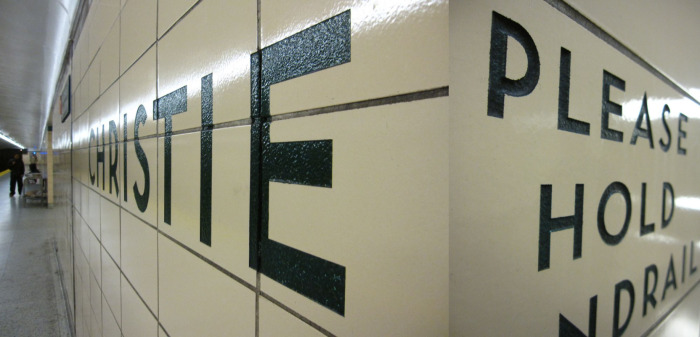
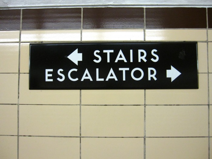
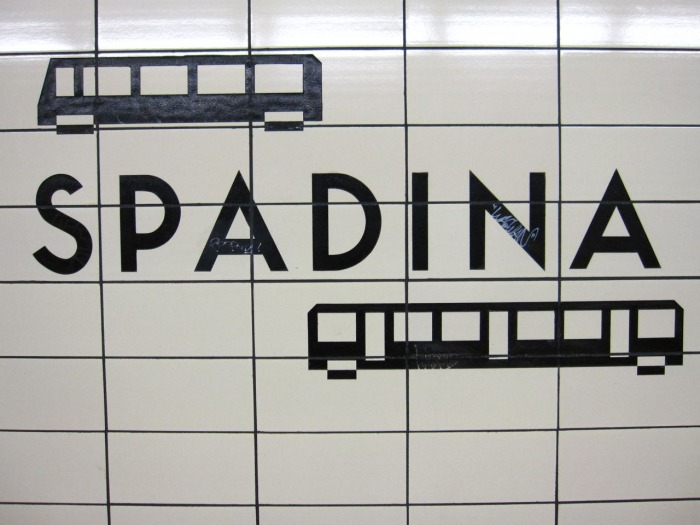
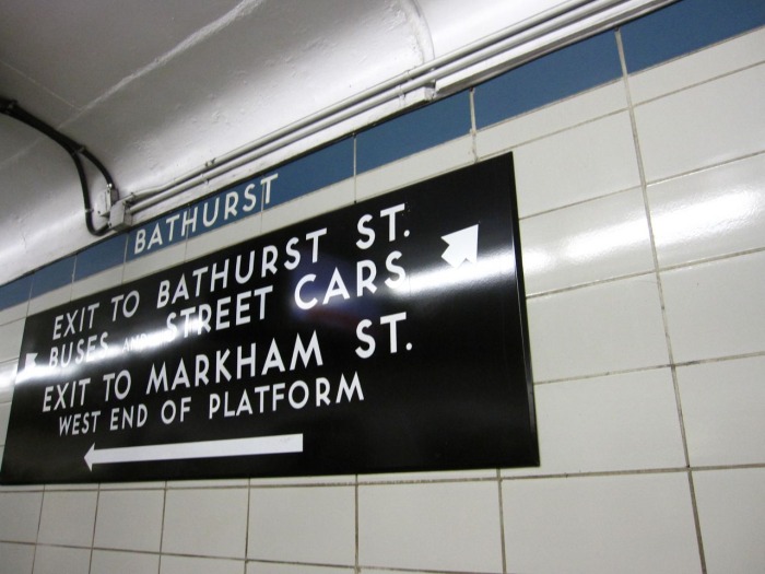
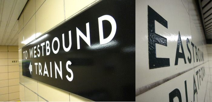
Unlike New York's subway system (set in Helvetica, of course), Toronto's subway system signage is set in a typeface very similar to one of my personal favourites: Neutra. It possesses the same mid-century modern qualities but it's not identical. For instance; the bottom strokes (aka legs) of the letterforms are different – they don't finish off flush to the baseline the way Neutra's does. Anyone know the name of it?
Update on 2010-10-25 17:42 by catherine mangosing
The typeface has been identified, thanks to an anonymous source. It's called Toronto Subway :)