


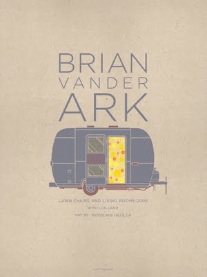

 I love the work of Kevin Tong, a California-based illustrator. I was particularly drawn to these band posters. Great color palettes. Check them out.
graphic design
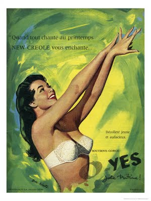
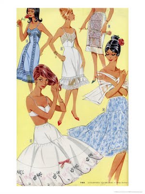
inspired vintage : lingerie and hosiery posters


50 books/50 covers
AIGA selected the 2008 winners of the AIGA 50 books/50 covers competition. The winning covers (chosen from over 900 entries) can be viewed at AIGA's website. I was thrilled to discover that my friend, Julie Morstad's work was one of the 50 winning covers! Congratulations, Julie!
Below are a few of the chosen covers...


there is life in this land yet
I'm liking the look of this line of custom silk-screened invitations by There Is Life In This Land Yet. I particularly like the ones printed on what look like handkerchiefs. Truly old school, turn-of-the-century. Bordering on creepy, yes. But for the right themed application, I could see this totally working.


sexy typography
Designer Juan Carlos Pagan did this series of fun typographic posters, Naked Type. I must say that I can relate to the notion of typography as being sexy because it can be (insert silly snicker here). It doesn't even need to be naked to be so. I mean, who doesn't love a well-formed ampersand? At any rate, I thought these were well done and sufficiently amusing...


love at the show: night owl paper goods
I spotted a couple of stand-out companies at the National Stationery Show yesterday. Night Owl Paper Goods is definitely one of them. Their cards are printed on sustainably harvested wood or eco-friendly papers. I adore their wood cards (of course) and the clean aesthetic. As they say, it's "modern and folksy." Cute!


beautiful covers: the book cover archive
A friend of mine tipped me off about The Book Cover Archive. It is a massive (and still growing!) collection of beautiful cover designs. The site allows you to search by designer, author, illustrator, publisher — even by typeface! I am endlessly inspired by beautiful and innovative book cover design. As a designer, I can't help but judge books by their cover... some of the time... ;) Below are just a few of my favourites...


graphic modernist: paul rand
Paul Rand is the easily the designer I most admire. He was incredibly original, prolific, and modern before his time. He was great at "defamiliarizing the ordinary" – making everyday, mundane things interesting again. A lot of his work remains relevant and timeless. His website houses an amazing collection of his work, even those I'm not familiar with. It also has his writings on design. I am working my way through them now. Inspired would best describe how I feel as I go through his work.
Here's a great excerpt from Integrity and Invention from 1971:ARTISTIC INTEGRITY
There are those who believe that the role the designer must play is fixed and determined by the socio-economic climate; that he must discover his functional niche and fit himself into it. It seems to me that this ready-made image ignores the part the artist can play in creating this climate. Whether as advertising tycoons, missile builders, public or private citizens, we are all human beings, and to endure we must, first of all, be for ourselves. It is only when man is not accepted as the centre of human concern that it becomes feasible to create a system of production which values profit out of proportion to responsible public service, or to design ads in which the only aesthetic criteria are the use of fashionable illustrations and ‘in’ type faces. The commercial artist (designer) who wants to be more than a mere stylist and who wishes to avoid being overwhelmed by the demands of clients, the idiosyncrasies of public taste, and the ambiguities of consumer research surveys must become clear as to what his cultural contribution should be. In all these areas he must try to distinguish the real from the imaginary, the sincere from the pretentious, and the objective from the biased. If the commercial artist has both talent and a commitment to aesthetic values, he will automatically try to make the product of graphic design both pleasing and visually stimulating to the user or the viewer. By stimulating I mean that this work will add something to the spectator’s experience.
The artist must believe his work is an aesthetic statement, but he must also understand his general role in society. It is this role that justifies his spending the client’s money and his risking other people’s jobs. And it entitles him to make mistakes. He adds something to the world. He gives it new ways of feeling and of thinking. He opens doors to new experience. He provides new alternatives as solutions to old problems. There is nothing wrong with selling, even with ‘hard’ selling, but selling which misrepresents, condescends, relies on sheer gullibility or stupidity is wrong. Morally, it is very difficult for an artist to do a direct and creative job if dishonest claims are being made for the product he is asked to advertise, or if, as an industrial designer, he is supposed to exercise mere stylistic ingenuity to give an old product a new appearance. The artist’s sense of worth depends on his feeling of integrity. If this is destroyed, he will no longer be able to function creatively. Below are some of my favourites from his gallery:
A logo for Esquire magazine... just subtly naughty, SO modern for 1938!

I love this one for Yale University Press (1985)

Consolidated Cigar Corporation (1959)

Norwalk Cancer Center (1996)

Ford Motor Company (discarded logo, 1996) love this!

Direction magazine cover (Dec 1940)

Apparel Arts magazine cover (Oct/Nov 1939)

June 1939

the man himself

gorgeous visual identity design: alembic bar in SF
in bar, design, graphic design, print design
I absolutely love the visual identity design for this The Alembic Bar in San Francisco! It's old world, somehow modern at the same time (and not overdone). Their website is very well done as well. Check it out.


Photos are from CommArts.com
triple threat: frank chimero
Frank Chimero. He's an illustrator, graphic designer and writer (and professor!) and I love his work! Playful visuals, typography and messaging. It's clever all around. Not to mention the blog that is all about his thoughts on the creative life. I'm quite inspired. This NERD poster directly below has obvious personal significance ;) and therefore my favourite.


curated.
The company I work for (3:SL Creative) was lucky enough to find office/studio space to share with an interior design firm called Curated. Not only do we get regular glimpses at beautifully designed rooms, we get to work out of their gorgeous space. Admittedly, I also enjoy overhearing snippets of interior design-related conversations :)
Below is a book that Curated published to show off their work and their inspiration. I thought it was so well done, I had to share. If I had better lighting equipment and a seamless white backdrop, I would have been able to take better photos of the book. Hopefully, the images below will give you an idea. It was designed with meticulous detail. Even the "inspiration" section was printed on toothier, warmer, uncoated stock.


Here are images from their current and past projects that I particularly liked. Love their style, the use of mid-century modern furniture as well as their use of color. Plenty of inspiration here for my future apartment. I'd love to be able to afford to hire them one day...


speaking of cinematic...
I am a immense appreciator of well-designed, clever, creative and beautiful title sequences for film (as well as the films themselves, of course). Art of the Title is solely dedicated to featuring great sequence titles. The examples above are just a few of them. They also have viewable clips of each one. Love it.

Stranger Than Fiction

Juno

High Fidelity
 Delicatessen

Napoleon Dynamite
lovely package, darling.


Who doesn't get seduced by beautiful packaging? I love it and enjoy being part of the design process (when I get the opportunity). Lovely Package™ is the place to go to see beautiful, clever and delicious examples of all things packaging design related – from all over. Great name too. Above are just a few examples. Talk about inspiring.
Here's another packaging design blog of note: The Dieline