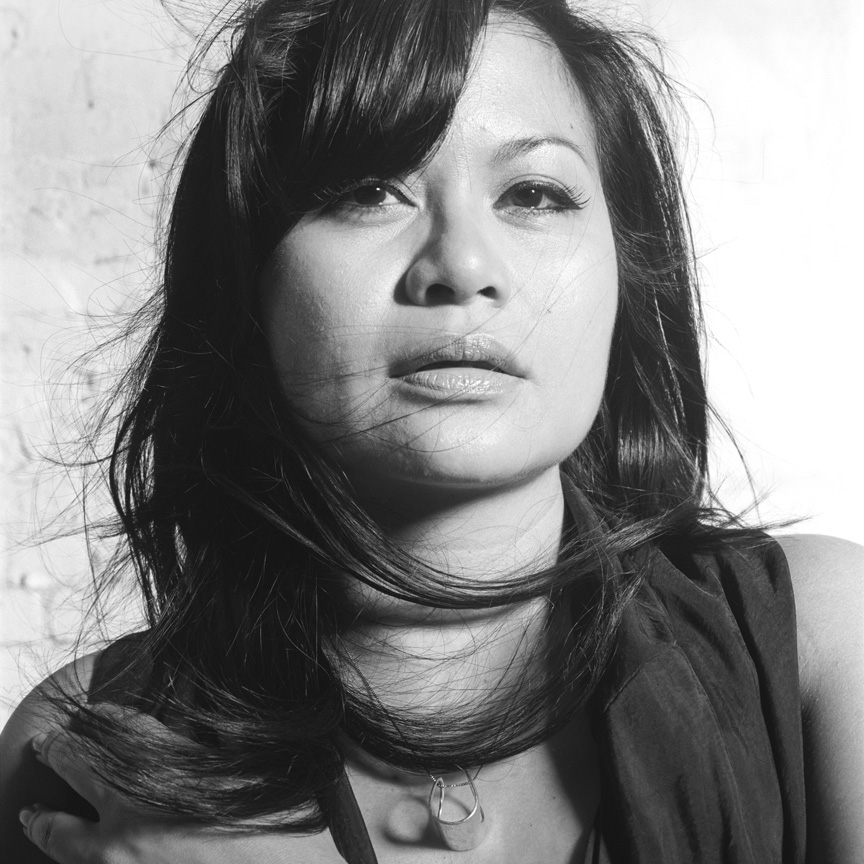
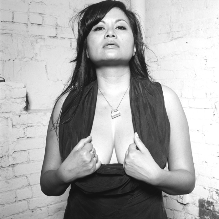
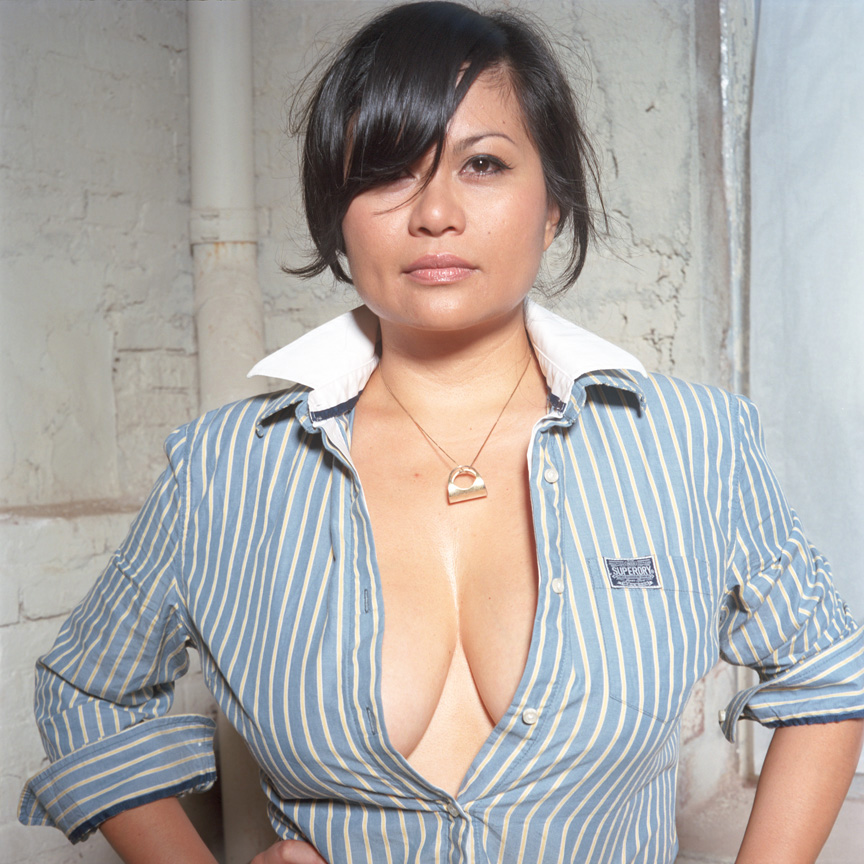
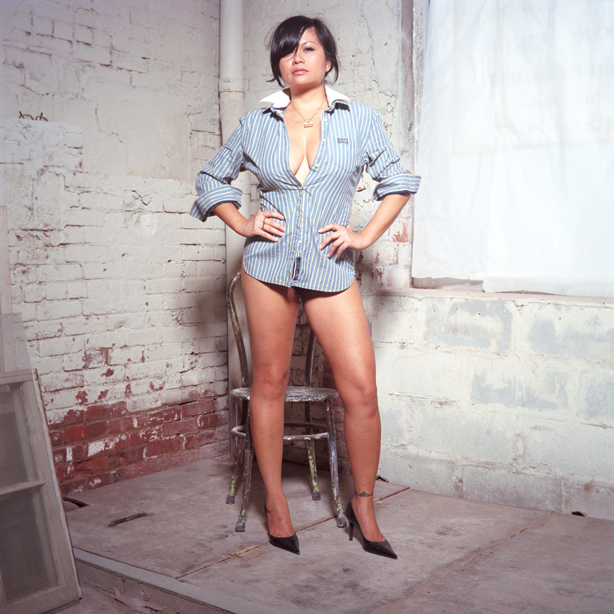
Having the opportunity of being photographed by a master like George Pitts is something I will remember for the rest of my life. Finally getting a chance to have a look at a few of his final selections is, to put it mildly, very exciting. So here are some of the results of the photo shoot in July. In case you missed my original post, these photos will be considered for publication in George Pitts' upcoming fine art book for Taschen. The subjects for the book will consist of provocative photographs of women 35 and over. I am intrigued by this project and deeply honoured to be asked to be a part it. I was, needless to say, thrilled to be shot by such an accomplished artist.
Prior to the shoot, George Pitts did ask me whether I would need help with hair and makeup. Having reasonable faith in my own ability to handle this, I chose to do it all myself. I also didn't feel as comfortable working with someone who's work in this arena I wasn't familiar with. So I also wore all my own clothing and jewelry. I wanted to look timeless, elegant and definitely did NOT want to look as though I was in costume.
The whole experience was incredibly liberating. I was beside myself that whole day. I learned new things about who I am through the experience. I definitely pushed my own boundaries and forced me to confront my own insecurities. Although I consider myself to be quite confident (generally speaking) there is NOTHING quite like being photographed without your clothes on. It was as empowering as it is humbling. As someone who is already hyper-aware of popular imagery, it is a challenge to view my own photos without the filter/bias of commercial photography in advertising. I had to also come to terms with the idea of being photographed in a more provocative manner. This is something that became all the more real after actually seeing the final photographs. Another interesting discovery I made is that although I typically am pretty attached to eyewear (which I have worn and identified with for years and years), my favourite photographs turned out to be the ones where I am NOT wearing them. I actually like the way my face looks without the glasses. A bit of a surprise for me.
These photos have memorialized a time, age and place in my life here in New York that I can fondly look back on when I'm, say, 60. In many ways, this year has presented more challenges and changes than I have ever gone through. In many ways, it seems quite appropriate that this transitional period be recorded – on film, no less. Thank you to George Pitts for the amazing photographs, the incredible experience and dialogue.
To see the rest (and more revealing...) photographs, you'll have to wait and see if they make it into the yet-to-be-named book. ;)

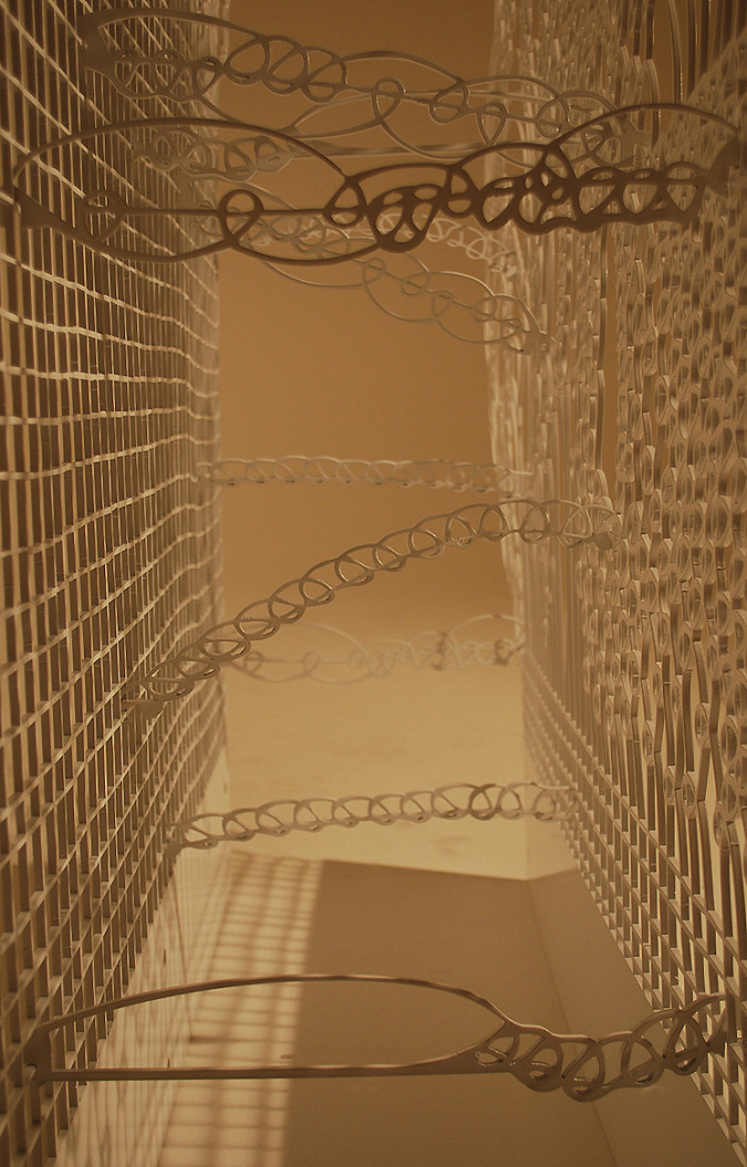
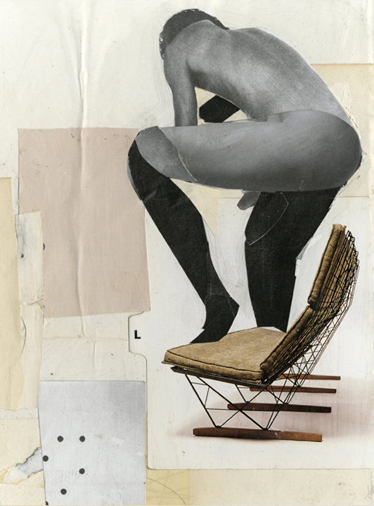
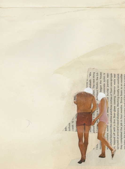
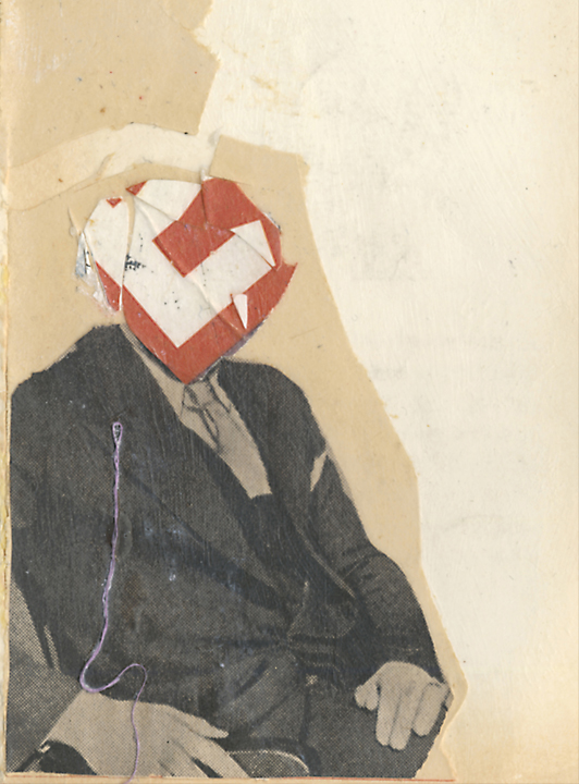
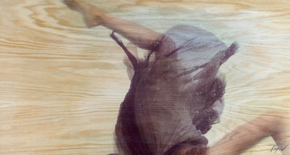
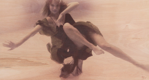
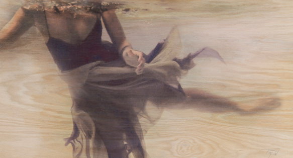
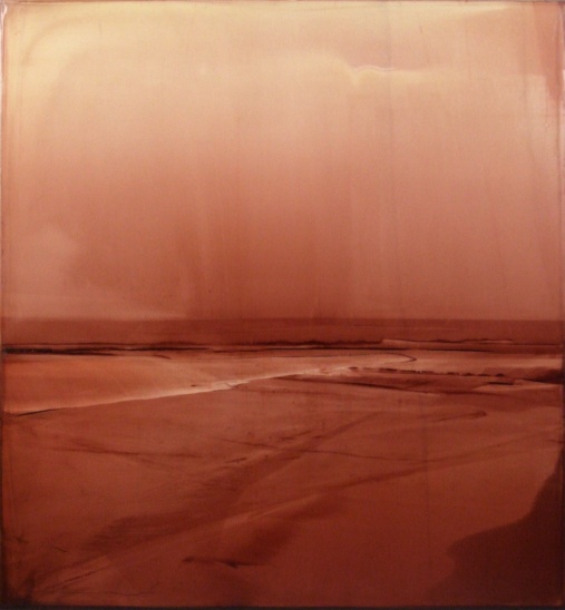
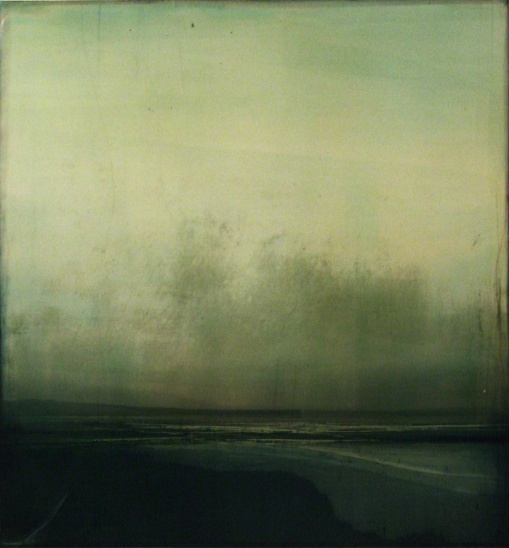
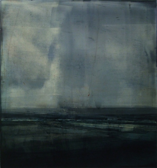
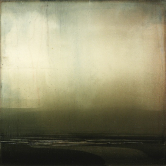
 Images are from markelfinearts.com and kyanderson.com
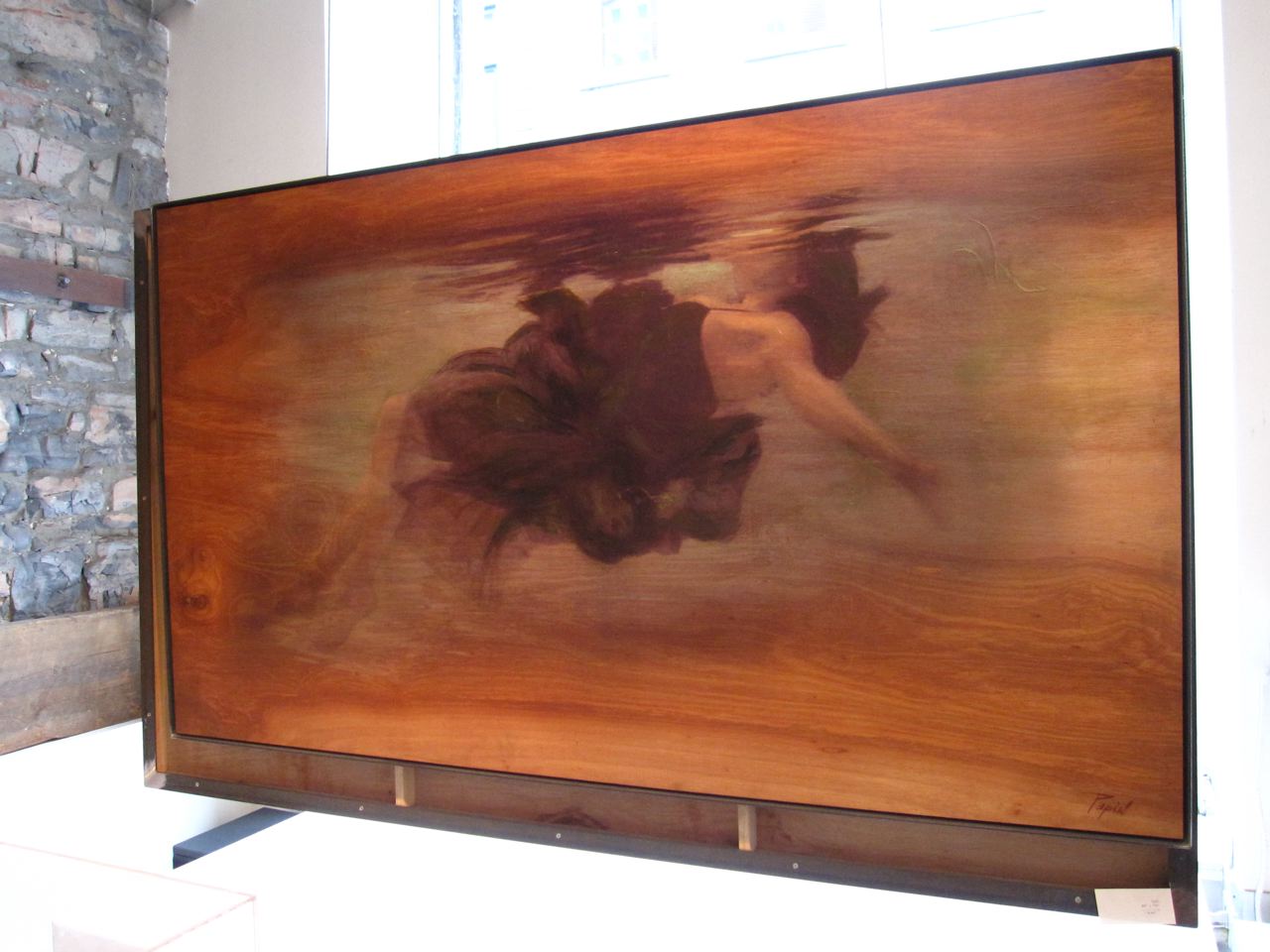